Max
Max
Understanding customer needs and behaviors to deliver a completely new digital experience.
The largest fashion brand in the Middle-East, North Africa, South East Asia and India, Max has over 500 stores in 19 countries, offering a vast range of clothing, accessories, and footwear for the entire family.
MY ROLE AND THE TEAM
I worked on the research, analysis, and ideation of the desktop designs with another colleague. I also led the usability testing activities for all platforms. The team was composed by the product manager, designers who took care of the other platforms, front-end/back-end developers and QA.
PROBLEM STATEMENT
The brand was looking to improve the inspirational and product discovery journeys, by focusing more on the customer's needs and not only on the brand's goals as the previous designs. They were also having the need to improve the pages flexibility for better merchandising.
UNDERSTANDING THE CUSTOMERS
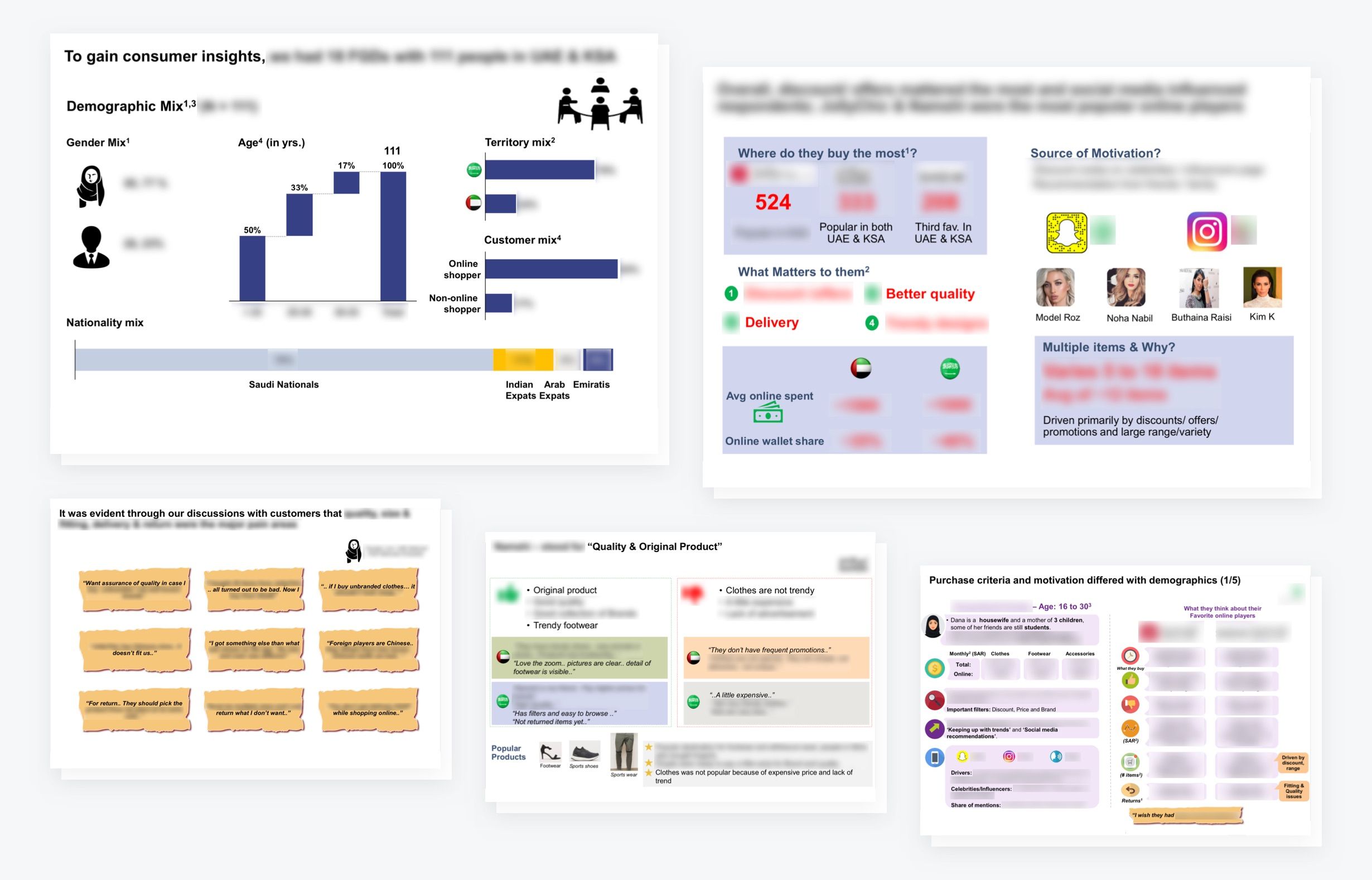
With the objective to understand the behavior, needs and pain points of online fashion buyers in the United Arab Emirates and Saudi Arabia, Max did market research including qualitative and quantitative studies, which gave us a lot of insights about the customers.
The output of this research was an extensive report which gave us plenty of information about concerns, attitudes, shopping behavior and personas related to our customers.
After studying all given research, we figured out the major pain points and what matters for the customers when buying online:
MAJOR PAIN POINTS
- Quality
- Size/Fitting
- Delivery/Return
WHAT MATTERS FOR THEM
- Discounts/Offers
- Delivery
- Trendy Designs
- Quality
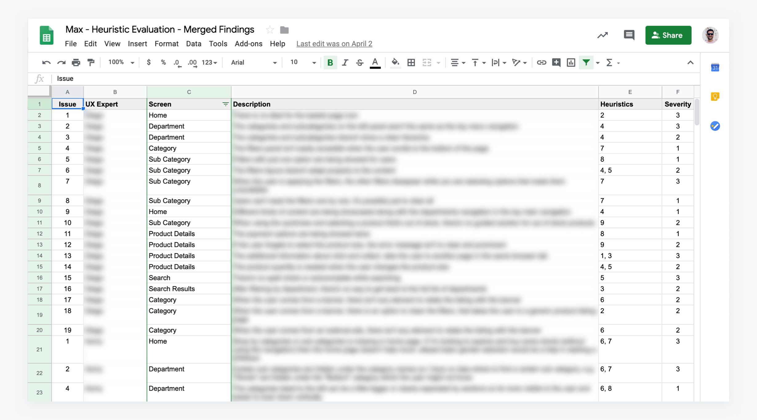
HEURISTIC EVALUATION
As a way to identify possible usability issues, I proposed the team to do a heuristic evaluation on all platforms. We used the Heuristics of Nielsen, where each of the 4 designers evaluated and classified the issues found on desktop and mobiles sites, and the iPhone and Android apps.
In the end, we merged the findings, having a long list of usability problems with proposed solutions to be implemented in the new designs.
COMPETITIVE ANALYSIS
Given the market research, I dug into the brand's websites mentioned by the customers when talking about positive and negative perceptions. The output of the analysis was a collection of screenshots where I tried to connect the findings from the market research with their interfaces.
That was important not only for me but also for the other members of the team, as together we could understand patterns of navigation, decision making information, communication and so on and so forth.
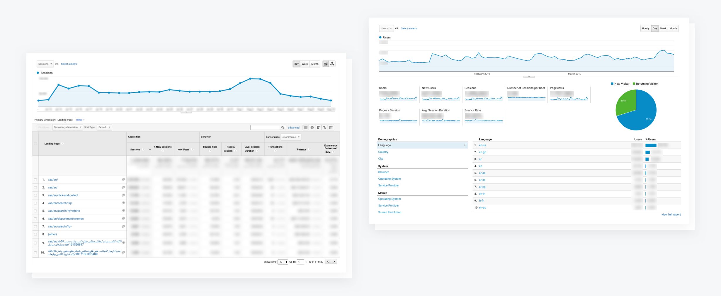
DATA ANALYSIS
To understand the behavior of the customers, we used Google Analytics and also had a few sessions with the analytics team. The understanding of the data gave us visibility of what was working on not in the current experience. It also helped us to set some KPI's that we wanted to improve in the new one.
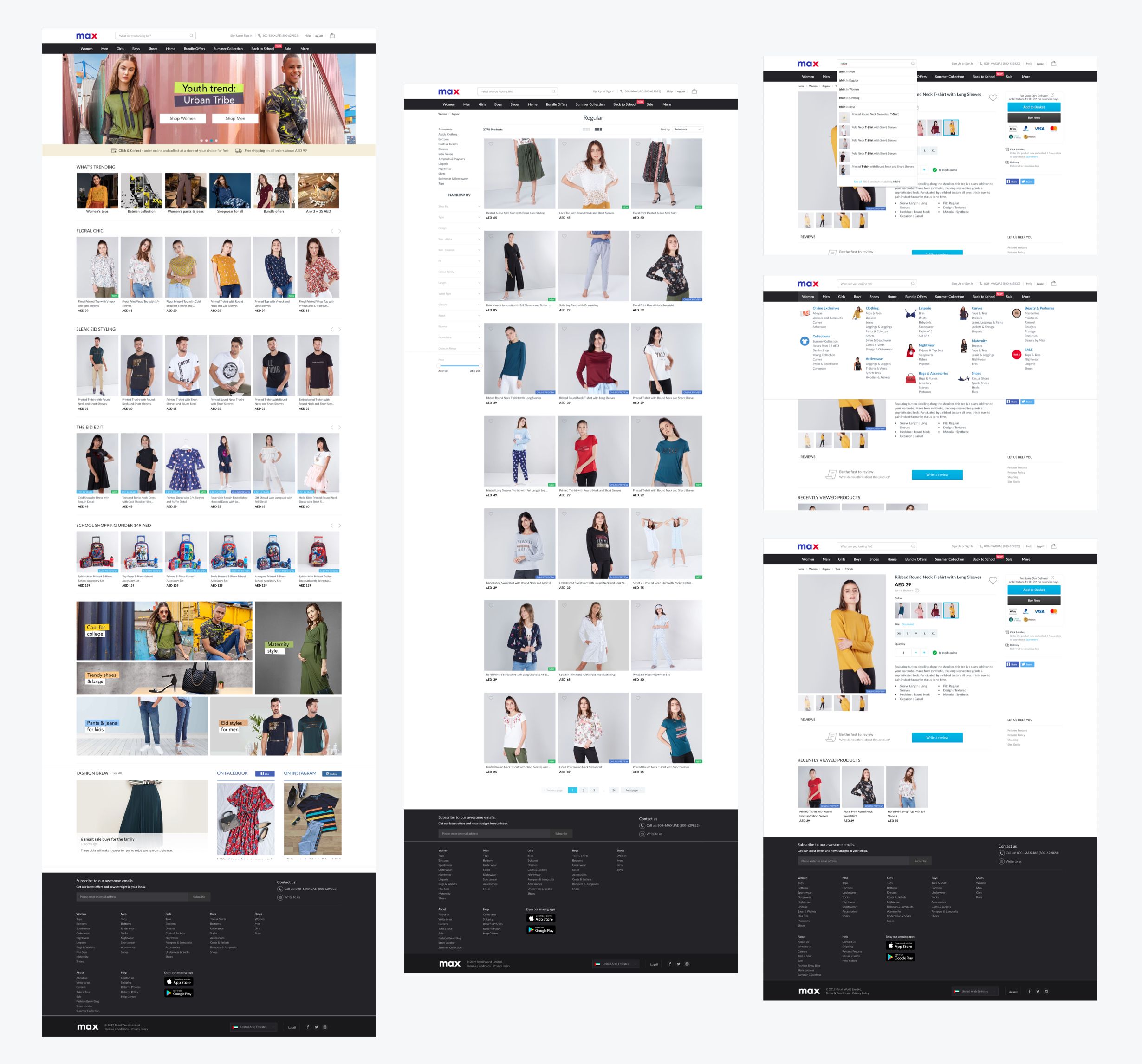
CONCEPTUALIZATION
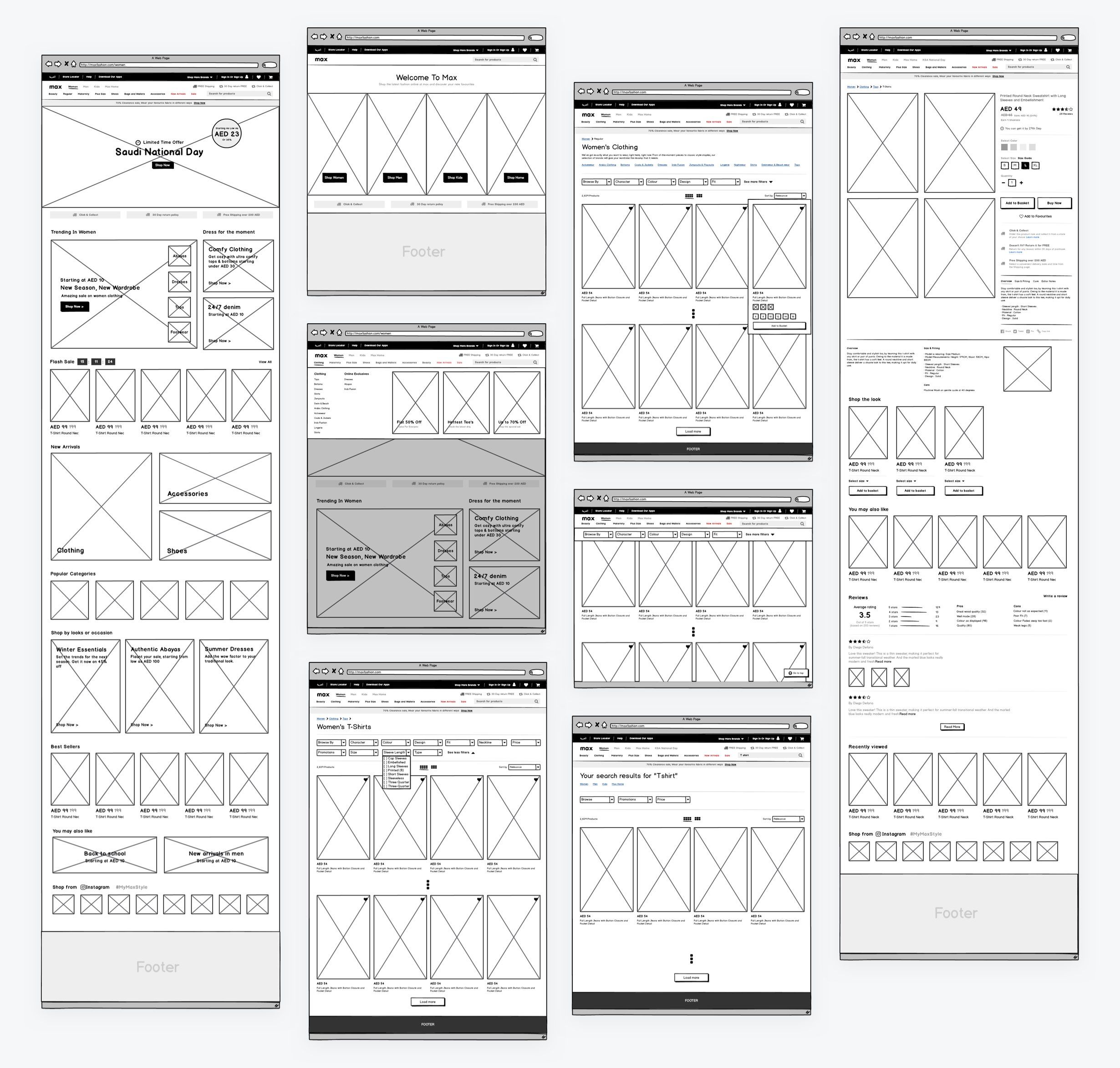
With all the necessary information in mind, we started to sketch rough ideas about the discovery journey that we were proposing, including home pages, product listing pages, offer pages, search results page, and product page.
After reaching a common understanding of how the information would be organized, we started to create the wireframes. Even though it was possible to start on UI with our sketches, the wireframes were important to get buy-in from stakeholders and also to hand over to the copywriting team, as they could work in parallel with us, providing the necessary copy.
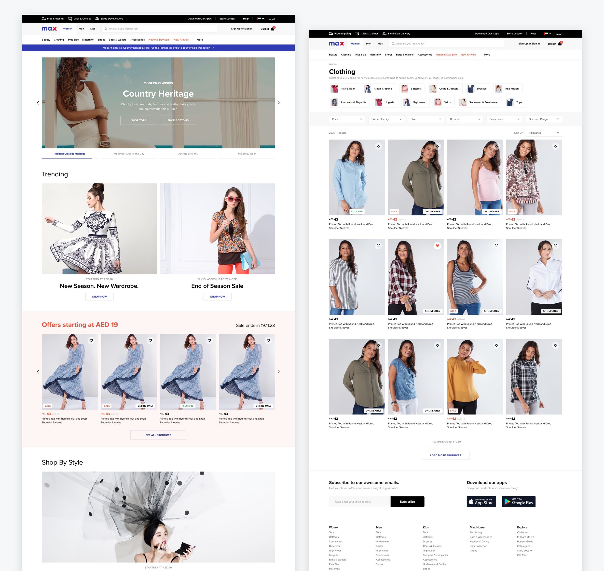
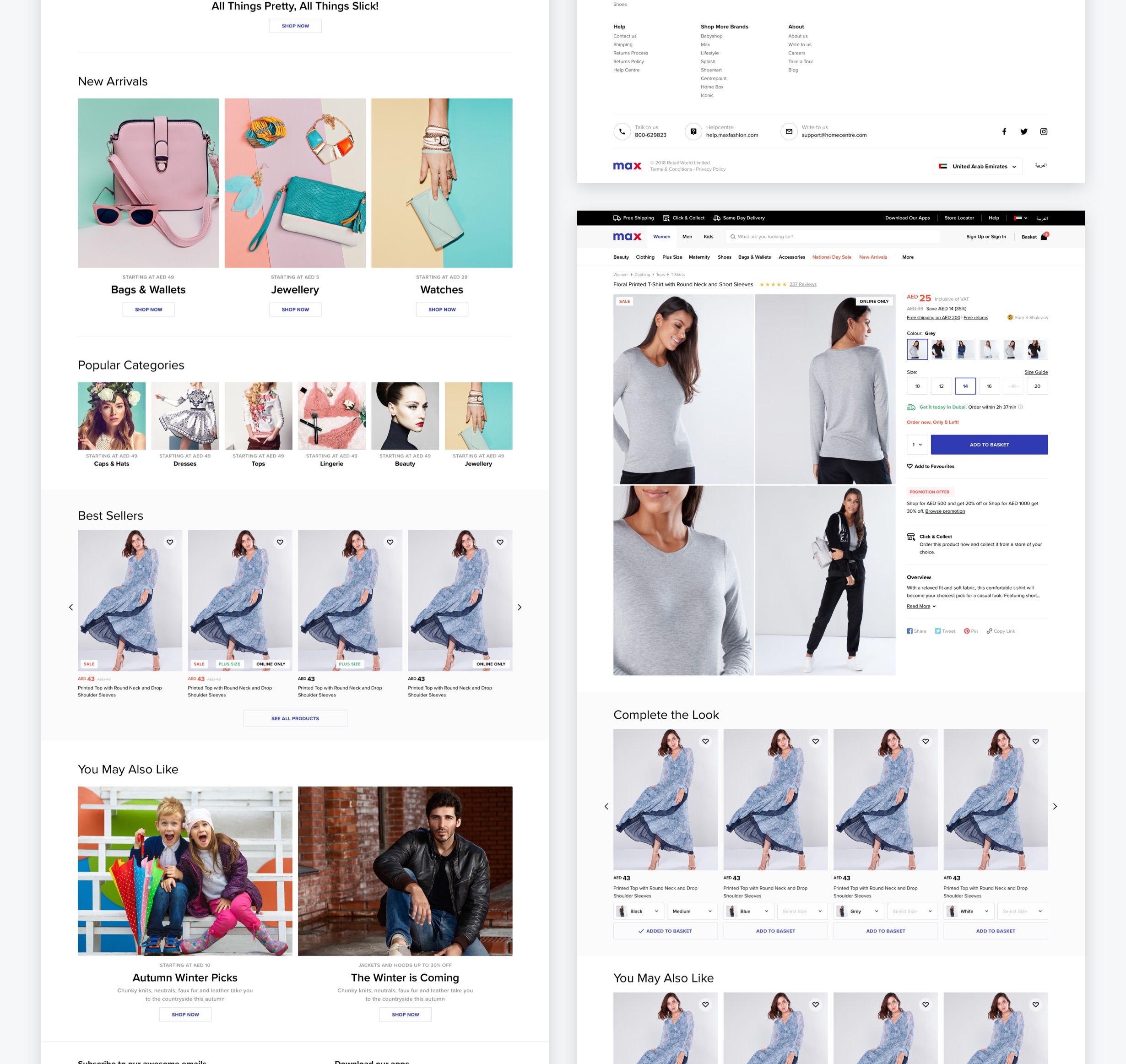
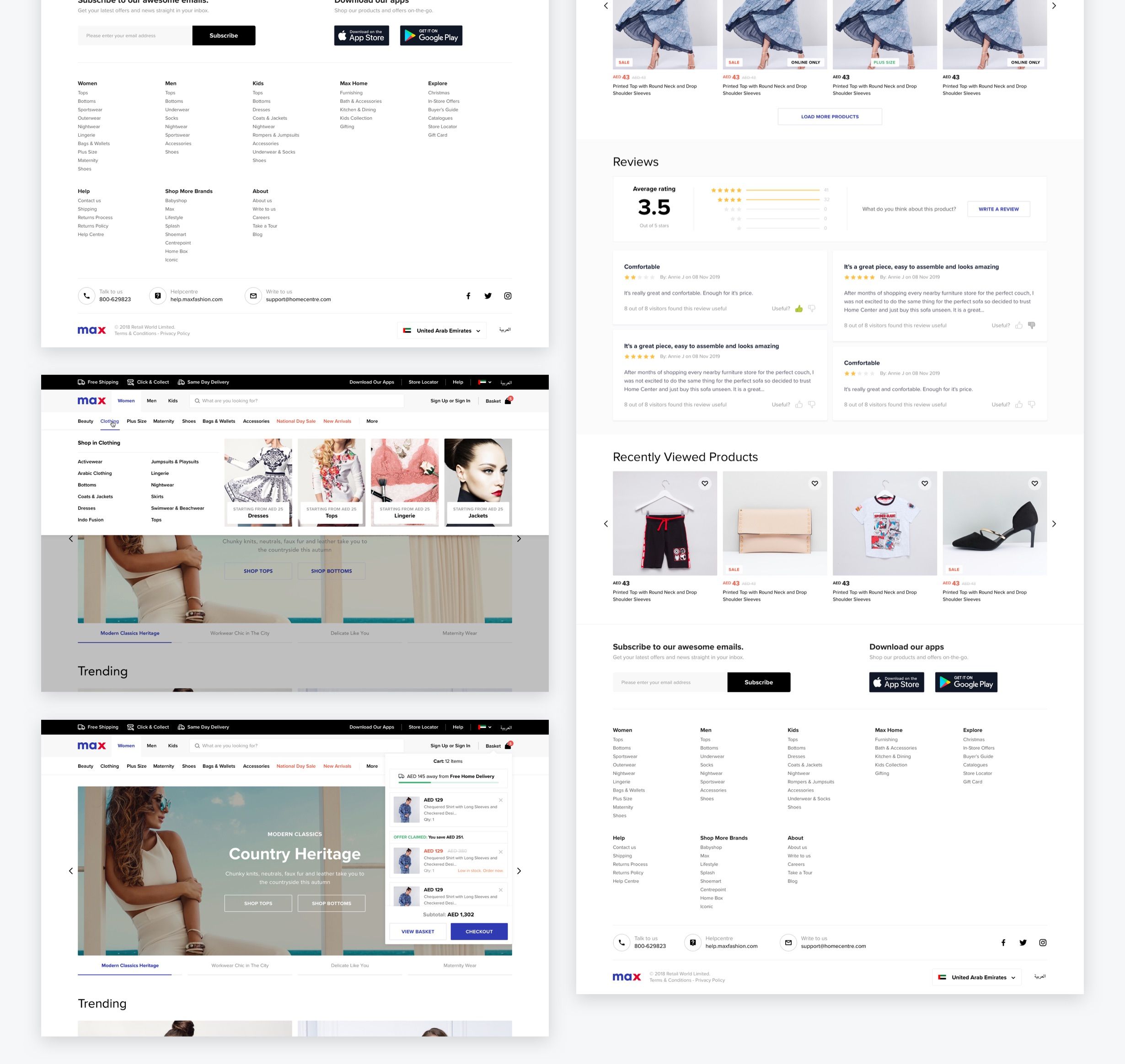
HIGH-FIDELITY PROTOTYPES
After getting the wireframes signed off, we had some co-creative sessions where all designers of the 3 platforms were experimenting colours, fonts and visual elements of the new designs. Once we reached a common understanding of the new visual identity, we started to build the pages and to experiment variations on the components.
During this process, we had a couple of sessions with the stakeholders until we got the final approval on the designs.
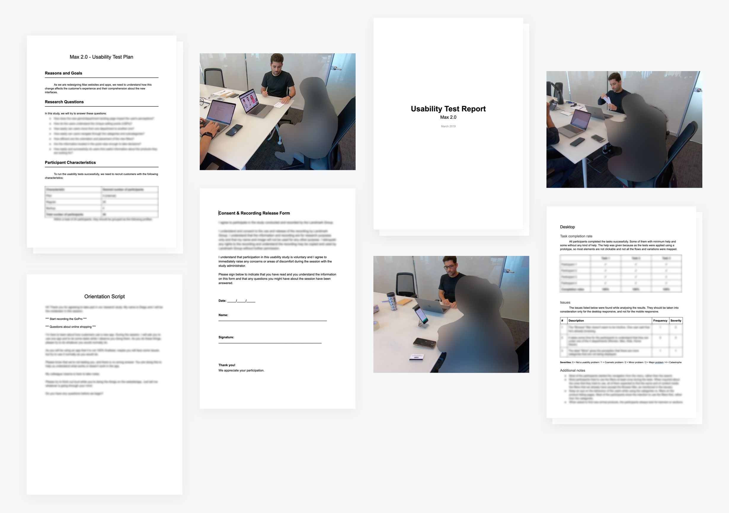
USABILITY TESTING
According to the plan, in parallel with the development and before the launch of the new designs, I started to plan the usability tests for 3 out of 4 platforms, including desktop website and the iPhone and Android apps.
In short, the profile of the testers was mainly formed by women who shop online, mixing Max and non-Max customers. After screening the participants, we separated them into 3 groups of 5 users and started the sessions.
The output of the sessions was a report where I identified some minor improvements for all platforms. These improvements were carried out by the designers who took care of the support for the development team.
Contact
For work inquiries, feel free to get in touch at eu@diegofaria.com.
Check my updated CV on LinkedIn.